Stacks Prototype
Project Contribution: UX Design | Playtesting | Interaction Design | Playtest
(click image to play vide)
The idea: I collected thousands of NFL trading cards as a kid, and one of my favorite things to do was to rearrange them in all the binders. Initially I would sort them by team, with special commemorative team cards at the top of the stack, then head coach cards, then QB cards, RB, WR, etc. At the bottom of the stack would be any players no longer with the team and so on. I maintained my collection like this for quite some time, until one day I decided to sort my cards by brand. So I went through all my stacks and sorted the cards into new stacks: Topps, Score, UpperDeck, Pinacle, etc.
As I thought of my past with collecting and spoke with other users on their practices I realized this was a huge gap missing from the current Topps suite of apps. Collecting is a very personal experience and every user views and mentally sorts their collection differently. I wanted to give the users in our app a space to do the same.
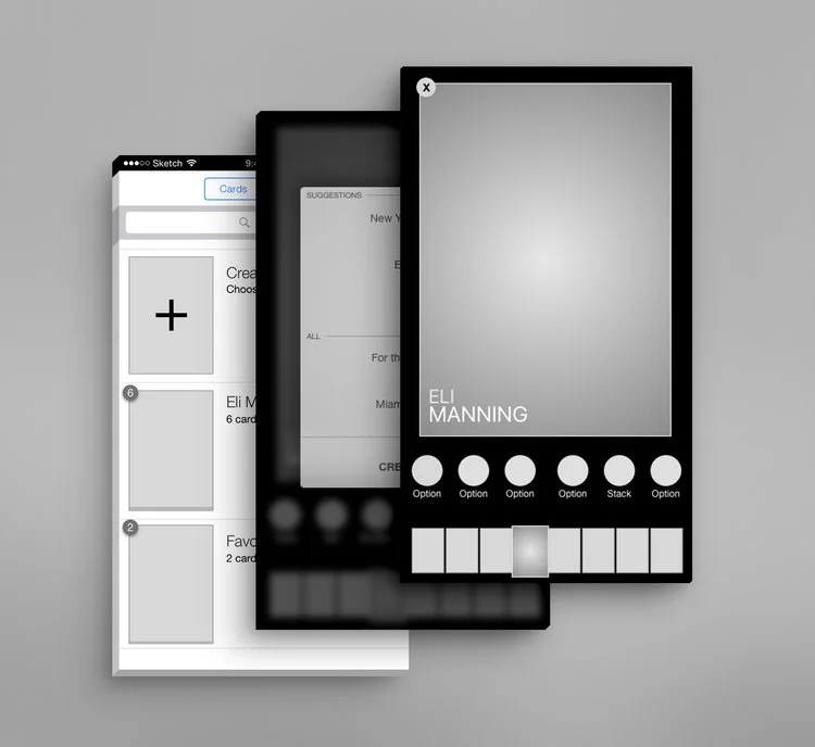
After creating the rough designs in Sketch I went through few iterations to find the right balance of practicality vs ease of use. The video above is an example of said InVision click-through prototype.
Above is the user flow and interaction notes created for the stacks prototype. These sketch files were ultimately brought in to Invision to create the prototype seen above.


