
Card Info Prototype
Project Contribution: User Flow | UX Design | Interaction Design | Motion Design

(click image to play video)
Topps was trying to force too much data on the back of their cards. Eventually they ran out of space on the back of the cards and began to implement a strange flip-to-flip-to-flip interaction, where each time you "flipped" a card it would show different data. Unfortunately that interaction doesn't fit with a user's mental model of what a card is - it's more of a cube or a hexagon.
The goal of this prototype was to create a user flow and associated interactions that would allow users to easily view their cards & associated card data in an elegant, future-proof layout.
In designing this interaction I wanted to focus on gestures instead of taps. Taps should always be available and obvious, but a mobile interface should have clever gesture interactions wherever possible. In this prototype I designed a 3-step swiping process where the user could reveal more and more information with just a swipe of the finger.
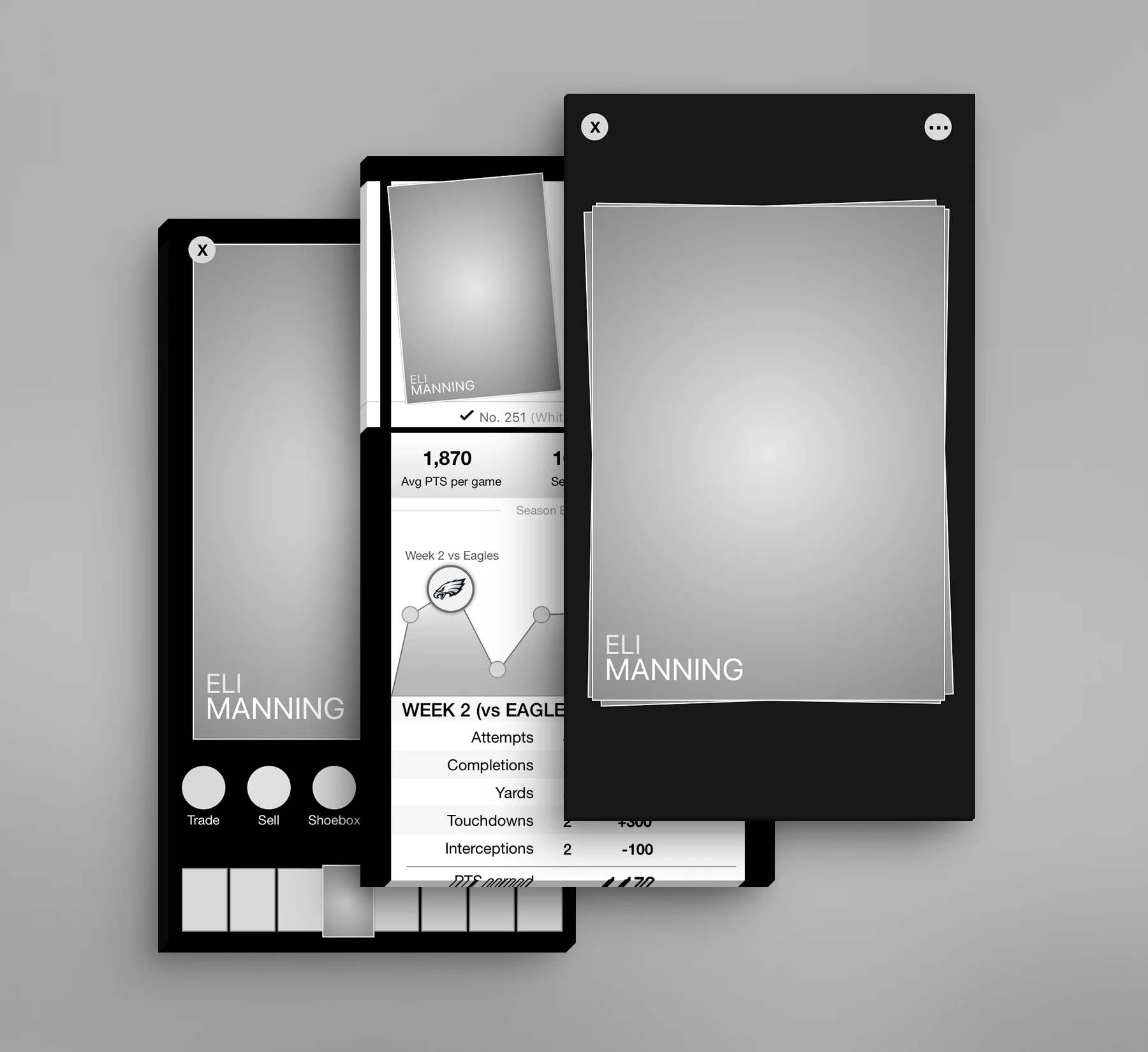
1. When first viewing the card we hide all of the various card options. I heard feedback from many users that they wanted to just see their cards displayed in all of their artistic glory, without a lot of other superfluous data to distract them.
Normal interaction pattern of tapping a card to see the back side of the card would remain unchanged.
2. However, those card options are still important interaction points and still need to be easily accessible. To accomplish this, I imagined an interaction where the user could either tap on the ... icon on the top-right corner of the screen, or they could simple swipe up on the card to pull the various options in to view. I also added a card scrub bar at the base of the screen to allow users to quickly zip through their collection.
The next time the user enters the screen we would remember which view they had previously used and return them directly to that view.
3. Finally, each card holds even MORE information that needs to be accessible. This information is only necessary to a certain type of collector or player - the casual collector it's not useful at all. This info should be discoverable but not part of the normal user experience.
To access this data the user would swipe up again (on the previous screen) on the card. This would move the card to a "more info" view as seen above, with all of the stats and game information presented in a beautiful, interactive bar graph. Additional data could be accessed by scrolling down the page.
As this view is desired by many users it's important that we allow them to continue to swipe between cards. To that end I disconnected the top of the screen with the card information from the bottom half of the screen with the card stats. The top half can still be scrolled left and right and the data beneath will update to reflect the new card.